ShopDreamUp AI ArtDreamUp


Suggested Deviants


Suggested Collections


You Might Like…


Description
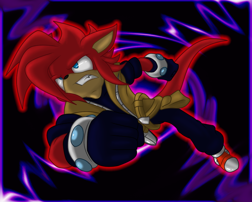
Still working on proper foreshortening but...we all gotta start somewhere right?
It be 's birthday today! So of course I had to make something. The guy's been a cool friend ever since I met him! So here ya go Zashy!
Zash ©
It be
's birthday today! So of course I had to make something. The guy's been a cool friend ever since I met him! So here ya go Zashy! Zash ©
Image size
1000x800px 536.66 KB
© 2011 - 2024 Ulta
Comments34
Join the community to add your comment. Already a deviant? Log In
Gotta say this piece looks quite marvelous, mate. Love how Zash shows motion right there, and his clothes are aligned perfectly in this image according to direction of flow. You pretty much showed a bit of detail too in the clothing too.
However, I'd like to point out all the flaws as I have spotted quite a bunch. First of all, where does the image lead to? It seems that he was drawn there with a simple background thrown at the back. There doesn't seem to be a consistent flow, which makes it hard for the viewer to match up all the details together and come up with whatever is going on. His tail was drawn incorrectly; it should have been pointing to the opposite of the motion direction, but it seems to be a little bent as if he were standing. It would have been better if it there was no bend, or if it was slightly bent upwards (just slightly, as in hardly noticeable). It's also a little longer than usual and shifted to the left.
Also, his legs are completely off. His outstretched left leg is way too far, while his right leg is a little up high, making it look shorter even with his right arm blocking the view. As for the background, it seems like a quick brush doodle or a random background from Google which was duplicated and pasted in an inverted position on the opposite side.
Yeah, sorry if this has way too many negative focuses, but it's what I usually do to help others improve. Still, you did a great job with everything else, including shading and such. Keep up the good work.